

Background
The redesign of the National Grid mobile app was an urgent request from National Grid customes and stakeholders alike, because the original version had various usability, functionality, and accessibility issues--making it difficult for customers to easily view and pay their bill. Customers had stopped using the app altogether, with the majority giving it a 1 star rating in the Apple App Store and Google Play Store. Additionally, J.D Power, a company that specializes in providing annual rankings for electric utility apps and websites across the nation, ranked the original app pretty low on their scale, applying necessary pressure on the business side to provide customers the redesign that they deserved. A well done redesign was critical in order to win back the trust of our customers and make it easy for them to make payments on the go. Note: This case study focuses primarily on Residential customers. Commercial customers were accounted for with a different strategy.
My Role & Project Timeline
I led the end to end redesign of the app for both iOS and Android, owning the overall UX and UI. I worked very closely with the research team, the product owner, the developers, the copy writer, and our stakeholders from the very beginning. Additionally, because this was National Grid's only customer-facing mobile app, the existing design system at the time only catered to web experiences. I built a design library specific to the mobile app that didn't deviate too much from the design system, while making sure it was scalable and usable for any other mobile products the company might create in the future. View the "National Grid Mobile App Design Library" project for the full case study. The redesign of this app took about a year altogether to complete between the preliminary research; various iterations and user testing for both iOS and Android; and the building of a design library from the ground up.
The Why
Problem Statement
As mentioned in the above background of the project, the original version of the National Grid app contained various usability, functionality, and accessibility issues--making it nearly impossible for users to view and pay their bills with it. Having lost trust in the app altogether, most users defaulted to the website or called National Grid to make payments and report service issues.
Hypothesis
We hypothesized that a simple, intuitve, usable, and accessible app that made it easy for our users to view their bill, track usage, pay their bill on the go, and quickly report any service issues would help us regain the trust of our customers and help reduce the number of calls the National Grid call center received on daily basis. Additionally, because the website contained layers of detailed information, our goal wasn't to carry over all that information into the app. Rather, we wanted to create a simplified and useful version of it, while incorporating surprise and delight elements that would entice our users to keep coming back.
Business Opportunities
If done well enough to address our users' pain points, the redesign of the app would alleviate the negative ratings and comments in the Apple App Store and Google Play Store(helping to regain their trust), in addition to receiving a better ranking from J.D Power. Moreover, a redesign that properly addresses users' needs would lower the costly number of calls the National Grid call center receives on a daily basis from frustrated customers who just want to pay their bill or report a service issue.
Workshop Time
I started out by organizing a couple of initial workshops together with the research team, the product owner, developers, and our copy writer. We looked at data on the existing app such as usability issues, tech specific issues, completion rates, drop-off rates, past user research, as well as voice of customer data such as app store reviews. Afterwards, I gathered the insights from these initital workshops and went to work to look at how I could redesign the app.
The Older Version of the App

Some Customer Reviews in the App Store and Play Store

Identifying Our Key Users
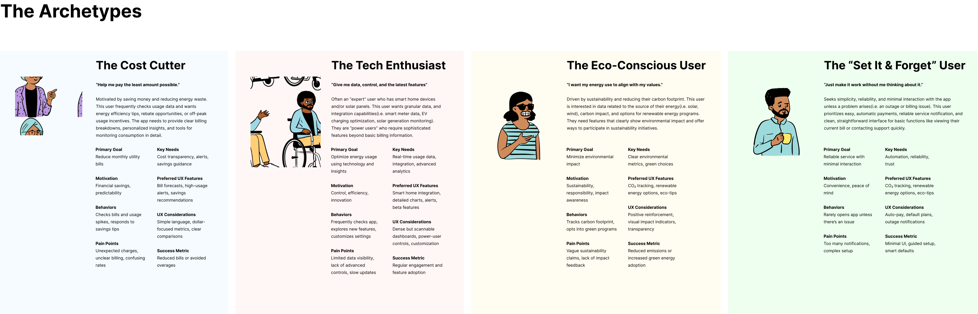
Digging deeper into past user research helped us identify who our key users are and how we can better serve them. From there, I created this user archetypes chart, which was instrumental in shaping which features we prioritized for the MVP vs Phase 2 of the app (Illustrations by Figma artist David Pinedo). After synthesizing the core needs of the archetypes, my team and I engaged in a feature prioritization exercise, where we were able to identify which features would make it to MVP vs Phase 2 of the app.
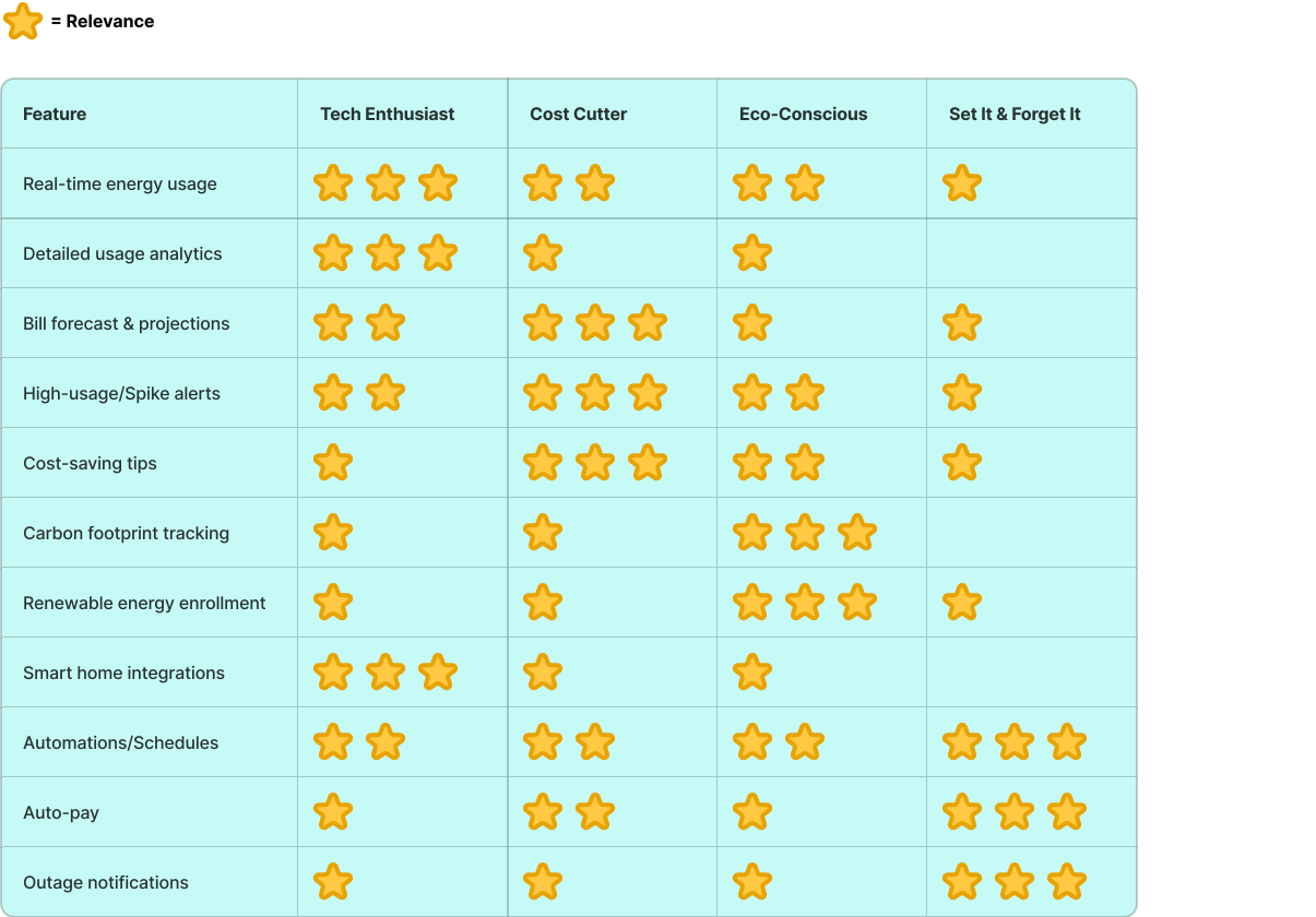
Feature Prioritization Map Based on Archetypes’ Core Needs
Synthesizing the core needs and painpoints of the archetypes, my team and I collaborated on this feature prioritization map, which helped us decide which features serve which users and where overlap creates the most value.
MVP vs Phase 2 Features(Prioritization)

The Concept
Taking insights from the workshops, the info we gathered about our archetypes from user research, as well as the feature prioritization exercise, I began drafting quick sketches of the redesign.
Some of the Low Fidelity Sketches

Some of the High Fidelity Variations

First Set of User Testing Results
Method and Participants
- 4 rounds of moderated testing with 24 participants in one week
- All National Grid Residential Customers
- All had used the original app at least once
- We wanted to gauge:
- feedback about the new look and feel using "Home screen V2"
- how easy it was to switch between accounts
- the integrated payment flow
- how much value the "Payment activity" and "Report service issue" tiles provided for users on the home screen.
Key Findings

Iterations Based On User Testing Results
Taking the results from the user testing sessions into account, my team and I felt it necessary to revisit displaying the "Payment activity" and "Report a service issue" on the home screen since they didn't provide much value for users as much as we assumed they would. Additionally, we wanted to make sure the ability to switch between accounts was pretty intutive. For these reasons, we decided to revisit the visual style of "Home Screen V3" from my previous iterations, and apply it across the app since it checked off all our boxes.
Home Screen V3 Style Applied Across Payment Flow
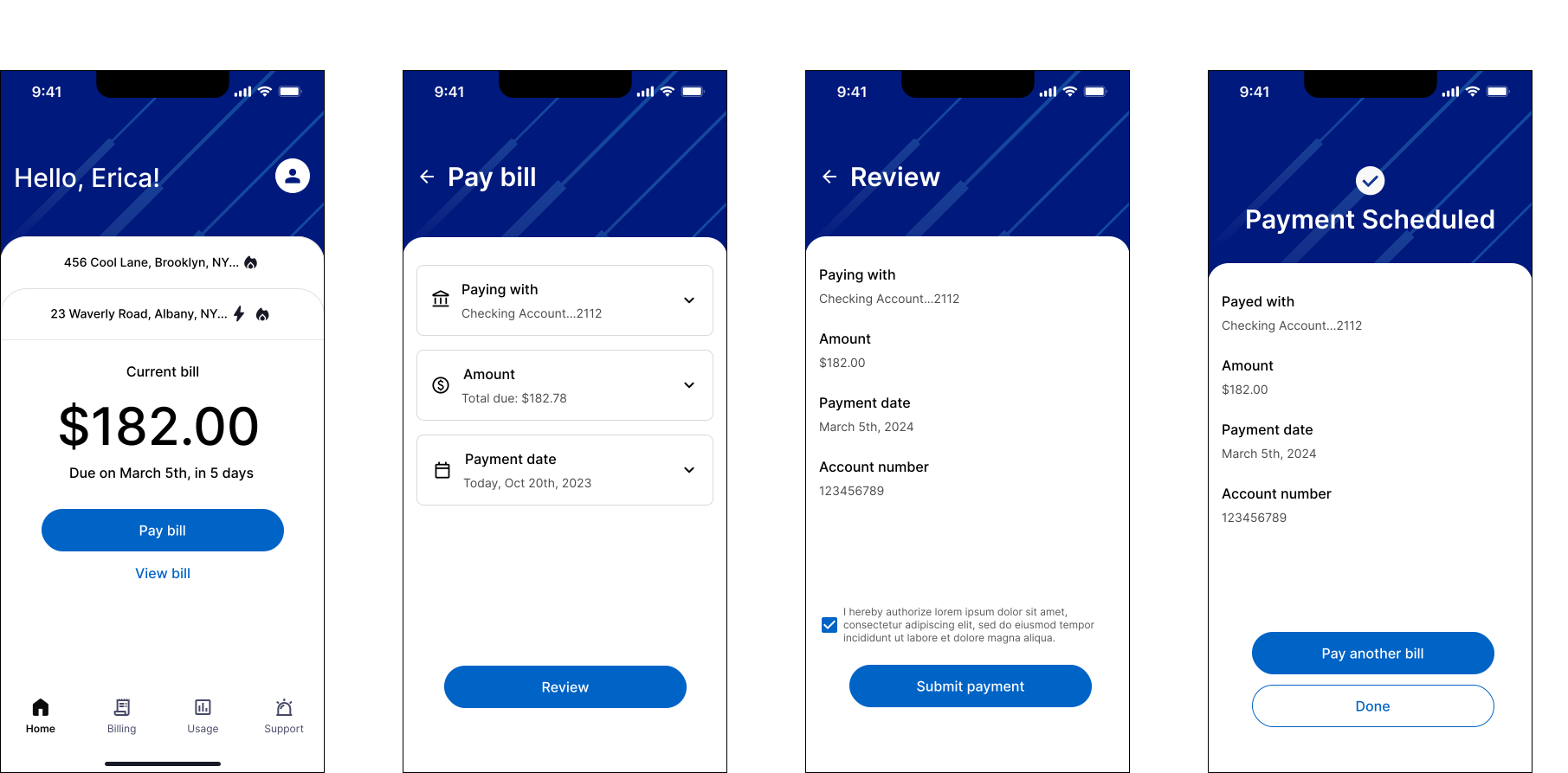
Main Tabs With Applied Home Screen V3 Style
In addition to applying the new style across the app and incorporating feedback from the previous set of user interviews, I also made sure to account for key insights that we identified from the core needs of the user archetypes. These included(but wern't limited to) savings programs and green energy programs to enroll in; real-time energy usage and detailed usage analytics, as well as outage notifications/status. The product and dev teams and I agreed that it made more sense to design the app with "Phase 2" features included, then work backwards toward the MVP. This would help the triad better prepare for what was coming in Phase 2.

Second Set of User Testing Results
Method and Participants
- 4 rounds of moderated testing with 24 participants in one week
- All National Grid Residential Customers
- All had used the original app at least once
- We wanted to gauge:
- how easy/difficult it was to switch between accounts
- how easy/difficult it was to scan and understand the "Billing" tab
- users' intepretation of information laid out on the "Usage" tab and whether or not it was helpful
- how helpful the outage status on the "Outage" tab was.
Key Findings

Final Screens

Future Roadmap
While the MVP version of the app was getting ready to be rolled out, I continued iterating on future versions of the app that included features such as predictive insights(AI), gamification/achievements, and personalized savings tips/goals. These were features the team and I had aligned on as part of the next set of features to pull in. I started coming up with various design options for how these new ideas could fit into the app, without overwhelming the user.