
Background
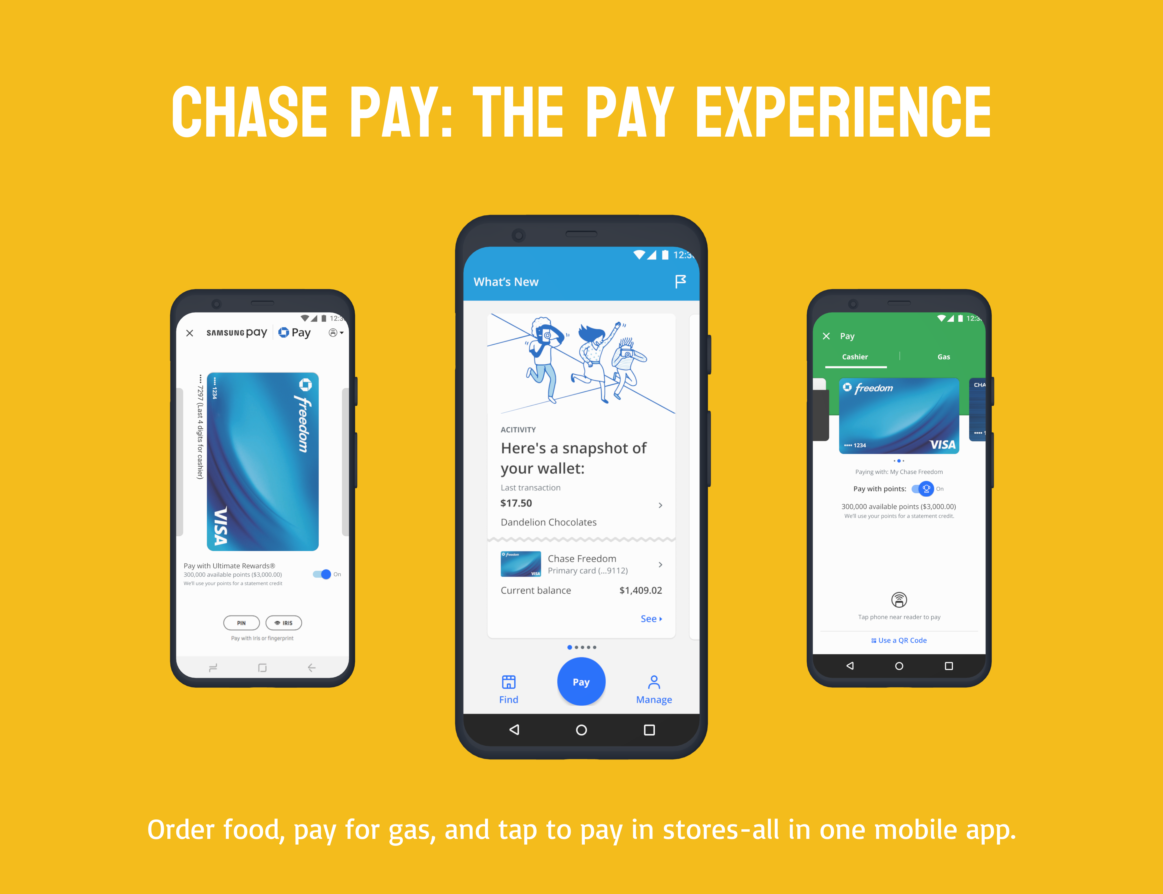
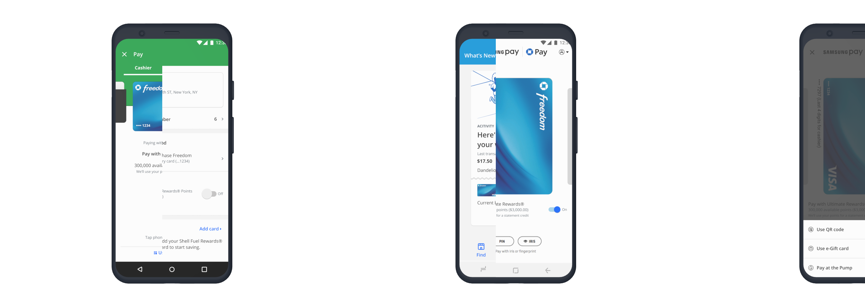
The Chase Pay app was a mobile app for Chase customers designed to be an NFC-enabled payment app for paying at the register, ordering food, and paying for fuel at the gas station. Think Uber Eats merged within Apple Pay, with the ability to pay for gas at the pump, while getting offers and rewards by using the app. For this particular case study, I will be focusing on the "Pay" experience within Chase Pay for Samsung users and non-Samsung Android users. The difference between the two pay experiences was that Samsung users had the option of a merged "Pay" experience with Chase Pay and Samsung Pay. Other Android users received the regular Chase Pay experience.
My Role & Project Timeline
I helped out with the UI and the UX of the overall app, but my main focus was owning and delivering the end-to-end "Pay" experiences for Samsung and other Android users. I also got to collaborate with Samsung designers for the Samsung experience. The creation of the Pay experience for both Samsung and other Android phones took about 3 months to complete (Nov 2017-January 2018).
The Why
Problem Statement
In collaboration with our Product owners, my design team and I recognized that the majority of our customers spent their money on food, clothing, fuel, and paying bills/friends and family. Many of them had various apps for some of things but found it tedious to switch between what they had installed on their phones. We wanted to start small by providing them with a digital wallet that could help them do at least 2 of those things(paying for food and gas), in order to help them eliminate the need for multiple other apps for ordering food and paying for gas.
Hypothesis
We hypothesized that a digital wallet that could help our customers do at least 2 of those things to start(paying for food and gas), would help them eliminate the need for multiple other apps for ordering food and paying for gas. Additionally, if they were rewarded for using the app through benefits like discounts/offers, they would likely want to continue using the app and perhaps even recommend if to friends and family who also bank with Chase.
Business Opportunities
Before the inclusion of NFC within the Pay experience, customers were paying with QR codes at point of sale to only merchants who accepted Chase Pay. With NFC in the picture, we had a larger pool of merchants to work with, and so did our customers. This not only increased usage with exisiting Chase Pay customers, but opened the door for new ones too.
Our Key Users
My team and I started out by gathering data on the existing design such as completion rates, drop-off rates, initial user research, as well as voice of customer data. Product owners, developers, accessibility partners, content editors, designers, and our UX researcher were all involved from beginning to end during our workshops. We did a complete audit of the entire app so that we can redesign it from beginning to end. I gathered the insights from these initital team workshops and went to work to look at how I could re-design the Pay experience for Android users.
The Chase Pay Archetypes
Before diving into any sketching, I looked at the Chase Pay archetypes we had developed as a team, based on secondary research(Forrester, Javelin, etc.), market research, and the user testing that had been conducted earlier that year(2017) on the orignal app design.

Common Needs of the Archetypes
Synthesizing the common needs of the archetypes helped inform the direction of the designs. It also helped ensure that I was designing with the user in mind, instead of assuming I knew what the user's needs were.

User Journey Through Payments
Referencing the common needs of the archetypes, as well as previous research, I created a user journey to illustrate what users are typically thinking, feeling, and doing from the moment they decide they want to make a payment, all the way to post-payment.

The Concept
Low Fidelity Sketches
Taking insights from the initial workshops, the info we gathered about our archetypes from user research, and looking at the competitive landscape, I began drafting quick sketches for the Pay experience for Samsung and other Android devices.

Mid Fidelity Sketches

High Fidelity Screens

User Testing
Method and Participants
- 2 rounds of moderated testing with 20 participants--10 Samsung users and 10 other Android users
- All used Chase as their primary bank.
- All had used Chase Pay within the past 3 months before this round of testing.

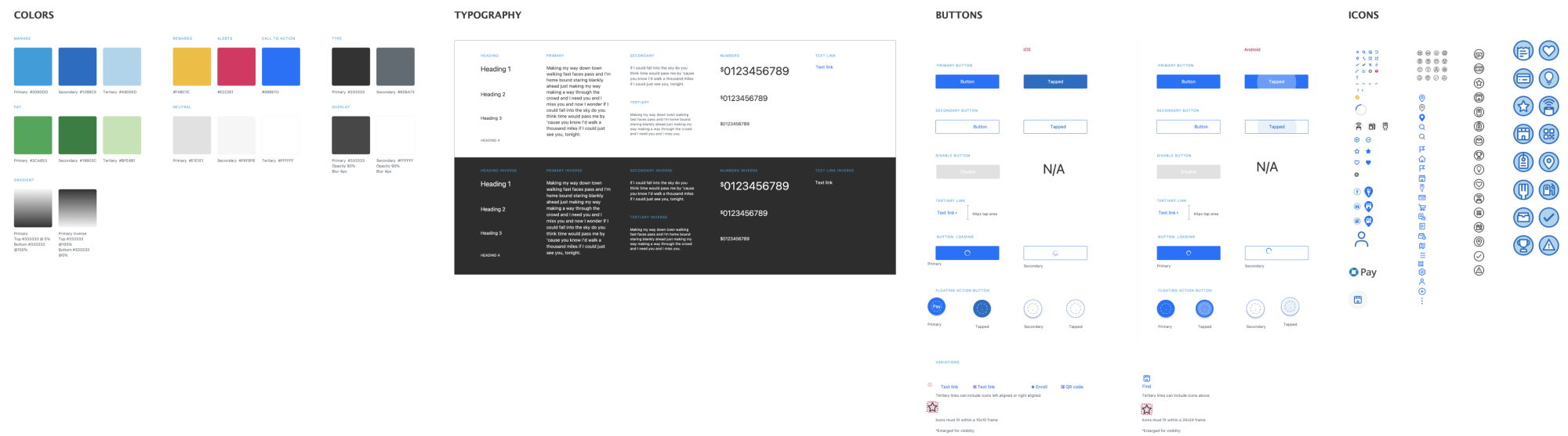
The Visual System
Final Screens
Future Roadmap
In anticipation of the ever-evolving "pay space", my team and I looked into incorporating other ways the app could be used(i.e. to pay for flights, gamification incorporation, etc). I started coming up with various desing options for how these new ideas could fit into the app, without overwhelming the user.